Technossus
Website
Redesign
Translating enterprise ambition into a cohesive, sharp visual language - from UI direction to a full design system and brand extensions.
My Role
Visual Strategy
UI Design
Design System
Deliverables
Visual Direction
Full UI Screens
Component Library
Timeline
6 Weeks
Full-time engagement
Context
Post-UX Phase
Wireframes provided
[Quick Overview]
Technossus is an enterprise technology consultancy operating at the intersection of AI, cloud, and digital transformation. When I joined the project, the UX foundations were already laid, my work was to transform those wireframes into a premium, high- performance visual experience that would signal authority, precision, and modern enterprise capability.
Every decision from the sharp typographic system to the deliberate red accent palette was made to build a brand that feels earned, confident, and built to scale.
Challenges
01
Building a visual language
02
Creating enterprise credibility without feeling cold or corporate-generic
03
Scaling a design system across a complex, content-dense site architecture
04
Maintaining visual consistency across different page types
GOALS
—
Establish a visual identity: sharp, confident, enterprise-grade
—
Design a system that developers can implement consistently
[01 - Visual Strategy]
Defining the
brand tone.
01
Brand Tone of Voice
The brand tone of voice - the emotional register behind
every visual decision.
Brand Attributes
Professional
Reliable
Innovative
Bold
MOODBOARD

Color System
Primary Palette
ed2939
1E1E1E
616365
eeeee
Background
010101
1B1B1B
232323\
343434
F9F9F9
Grey Scale
G1
G2
G3
G4
G5
G6
G7
G8
G9
G10
[02 - Design Principles]
Four principles
behind every
decision.
02
01
Clarity
Every visual element earns its place. Information hierarchy is never ambiguous — the eye always knows where to land first.
02
Scalability
Components are built to extend. The system anticipates new content types, industries, and feature pages without visual debt.
03
Consistency
A strict token system governs spacing, type, color, and motion — removing designer judgment from repetitive UI decisions.
04
Visual Hierarchy
Size, weight, and contrast are used with precision. Red is not decoration — it marks the single most important element per view.
[03 - UI Design Process]
From wireframe
to polished UI.
03
The wireframes existed.
My work was the translation.
The UX team had defined structure, flow, and user intent. I took that foundation and answered the harder question: what should this feel like? Every spacing decision, typographic choice, and color application was made to elevate the wireframe from functional to premium.
Translating flat wireframes into visual hierarchy
Establishing consistent component patterns across pages
Defining typographic rhythm for dense content sections
Building interaction states: hover, focus, active, disabled
Ensuring brand integrity across 6+ page templates
Validating responsiveness across all breakpoints
Wireframe
Homepage — Structural skeleton

Final UI
Homepage — Visual design applied

[04 - Design System]
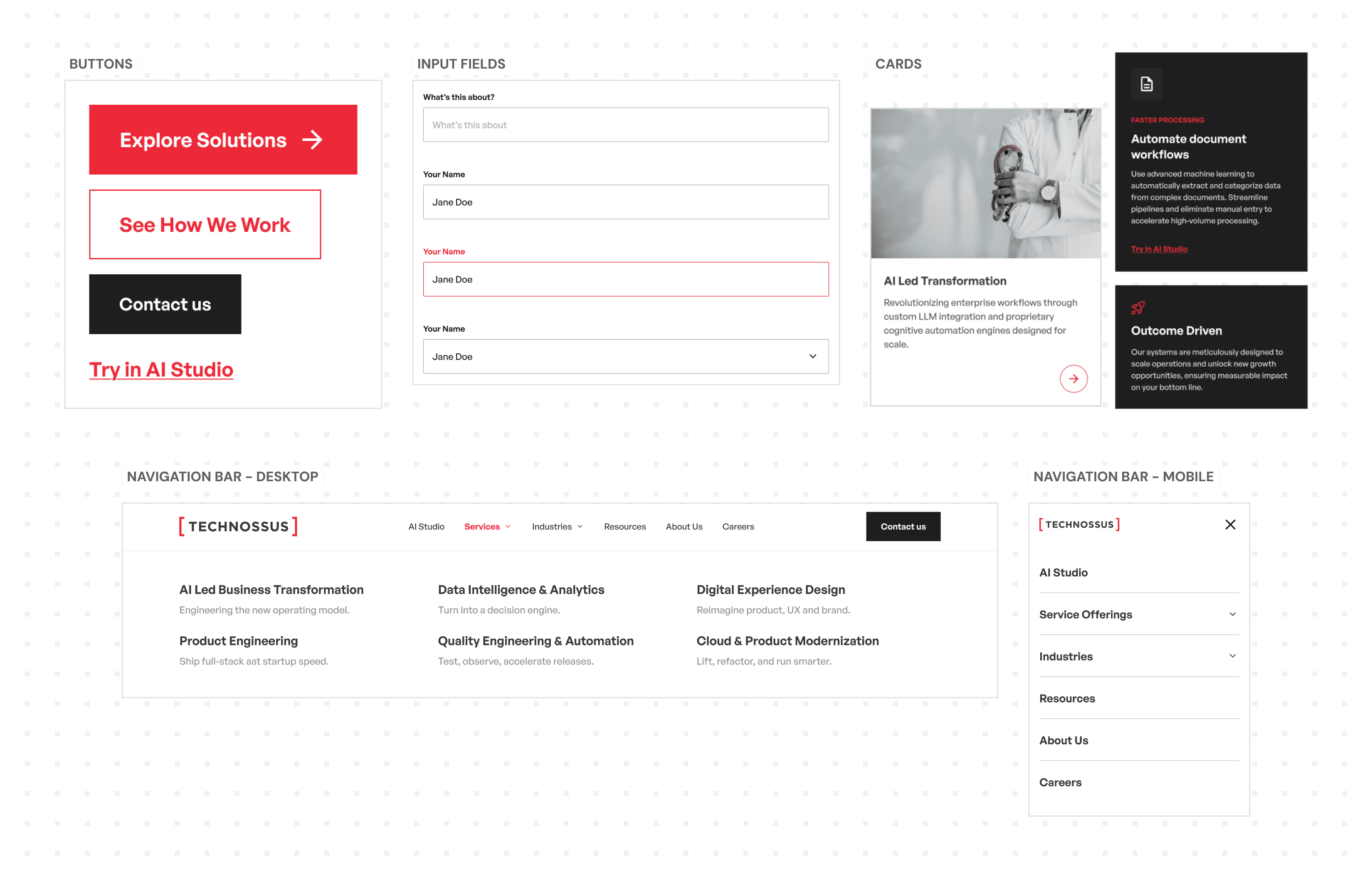
A system built
for precision.
04
[05 - Final UI]
The final
interface.
05
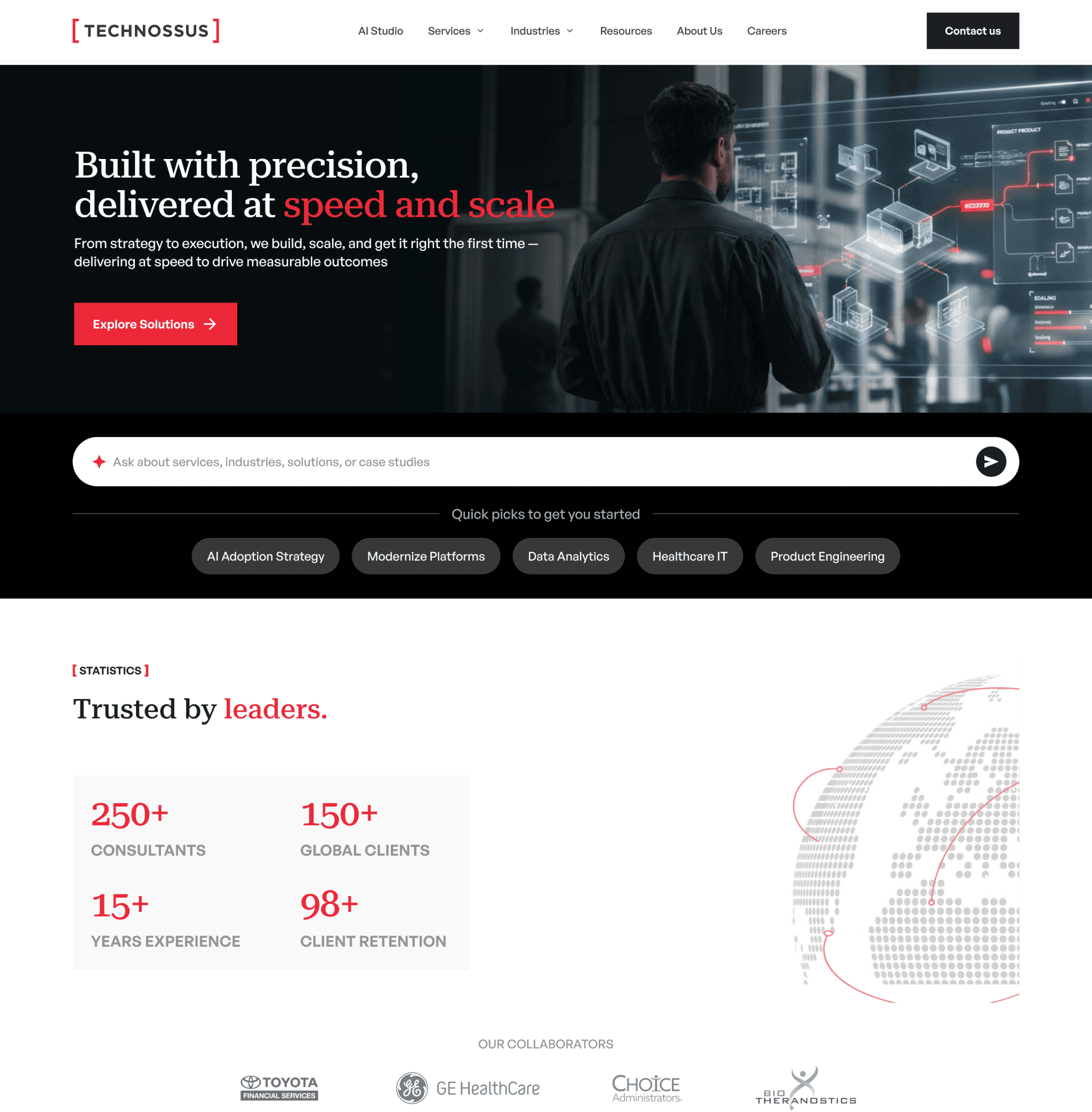
01
Homepage
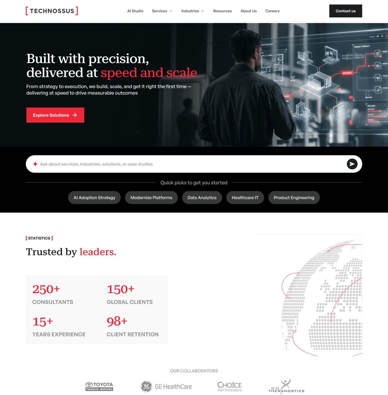
The homepage sets the entire brand register — from the bold editorial headline to the structured stats section and the red CTA strip. Designed to convert high-intent enterprise visitors from the first viewport.

02
Service Page
Each service page follows a strict structural template: bold problem statement, dark shift section with stats, accordion service list, and a featured case study. Red marks the single most critical data point per section.
03
AI Studio Page
An enterprise AI hub designed to turn AI exploration into real-world execution through use cases, accelerators, and structured workflows.

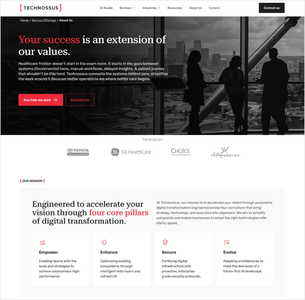
04
About Us Page
Executive portrait grid, company history timeline, and mission pillars — all anchored by the brand's editorial tone and sharp red-on-
black emphasis moments.
MOBILE SCREENS
Responsive Design

[06 - Impact & Learnings]
What this project delivered.
Design Impact
A complete visual system from zero
Page templates designed with full
component coverage
Reusable components reducing dev
ambiguity
Key Learnings
Entering post-UX requires building trust with the existing structure rather than redesigning it
Enterprise clients need visual confidence - restraint signals credibility more than decoration
Design tokens are the highest-leverage
decision — get them right early and
everything scales
Process Reflection
Starting with moodboarding and tone-of- voice alignment saved weeks of visual re- work
Red as a single accent color — not a palette
— was the defining constraint that elevated
everything
Sharp corners weren't a style choice — they were a brand statement about precision and intent

Technossus
Website
Redesign
Translating enterprise ambition into a cohesive,
sharp visual language — from UI direction to a
full design system and brand extensions.
MY ROLE
VISUAL STRATEGY
UI DESIGN
DESIGN SYSTEM
DELIVERABLES
VISUAL DIRECTION
FULL UI SCREENS
COMPONENT LIBRARY
TIMELINE
12 WEEKS
FULL-TIME ENGAGEMENT
[ QUICK OVERVIEW ]
Technossus is an enterprise technology
consultancy operating at the intersection of AI,
cloud, and digital transformation. When I joined the
project, the UX foundations were already laid; my work was to transform those wireframes into a premium, high-performance visual experience
that would signal authority, precision, and modern
enterprise capability.
Every decision from the sharp typographic system
to the deliberate red accent palette was made to
build a brand that feels earned, confident, and built
to scale.
CHALLENGES
01
Building a visual language
02
Creating enterprise credibility without feeling cold or
corporate-generic
03
Scaling a design system across a complex, content-
dense site architecture
04
Maintaining visual consistency across different page
types
GOALS
-
Establish a visual identity: sharp, confident, enterprise- grade
-
Design a system that developers can implement consistently
-
Extend the visual language to print and digital brand materials
[ 01 — VISUAL STRATEGY ]
Defining the
brand tone.
01
BRAND TONE OF VOICE
Defining the brand tone of voice
- the emotional register behind
every visual decision.
BRAND ATTRIBUTES
Professional
Reliable
Innovative
Bold
MOODBOARD
COLOR SYSTEM
PRIMARY PALETTE
BACKGROUND
GREY SCALE
[ 02 — DESIGN PRINCIPLES ]
Four principles
behind every
decision.
02
01
Clarity
Every visual element earns its place. Information hierarchy
is never ambiguous — the eye always knows where to land
first.
02
Clarity
Components are built to extend. The system anticipates
new content types, industries, and feature pages without
visual debt.
03
Consistency
A strict token system governs spacing, type, color, and
motion — removing designer judgment from repetitive
decisions.
04
Visual Hierarchy
Size, weight, and contrast are used with precision. Red is
not decoration — it marks the single most important
element per view.
[ 03 — UI DESIGN PROCESS ]
From wireframe
to polished UI.
03
The wireframes existed.
My work was the translation.
The UX team had defined structure, flow, and user intent. I
took that foundation and answered the harder question:
what should this feel like? Every spacing decision,
typographic choice, and color application was made to
elevate the wireframe from functional to premium.
TRANSLATING FLAT WIREFRAMES INTO VISUAL
HIERARCHY
ESTABLISHING CONSISTENT COMPONENT PATTERNS
ACROSS PAGES
DEFINING TYPOGRAPHIC RHYTHM FOR DENSE
CONTENT SECTIONS
BUILDING INTERACTION STATES: HOVER, FOCUS,
ACTIVE, DISABLED
ENSURING BRAND INTEGRITY ACROSS 50+ PAGE
TEMPLATES
VALIDATING RESPONSIVENESS ACROSS ALL
BREAKPOINTS
WIREFRAME - STRUCTURAL SKELETON


FINAL UI - VISUAL DESIGN APPLIED


[ 04 — DESIGN SYSTEM ]
A system built
for precision.
04
BUTTONS
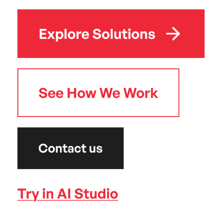
INPUT FIELDS

CARDS
CARDS

[ 05 — FINAL UI ]
The final
interface.
05
01
Homepage
The homepage sets the entire brand register — from the
bold editorial headline to the structured stats section and
the red CTA strip. Designed to convert high-intent
enterprise visitors from the first viewport.
02
Service Page
Each service page follows a strict structural template: bold
problem statement, dark shift section with stats, accordion
service list, and a featured case study. Red marks the single
most critical data point per section.

View More pages on Desktop
Responsive Design

[ 06 — IMPACT & LEARNINGS ]
What this project
delivered.
DESIGN IMPACT
●
A complete visual system from zero
●
Page templates designed with full component coverage
●
Reusable components reducing dev ambiguity
KEY LEARNINGS
●
Entering post-UX requires building trust with the existing
structure rather than redesigning it
●
Enterprise clients need visual confidence - restraint
signals credibility more than decoration
●
Design tokens are the highest-leverage decision - get
them right early and everything scales
PROCESS REFLECTION
●
Starting with moodboarding and tone-of-voice alignment
saved weeks of visual rework
●
Red as a single accent color - not a palette - was the
defining constraint that elevated everything
●
Sharp corners weren’t a style choice - they were a
brand statement about precision and intent
Technossus
Website
Redesign
Translating enterprise ambition into a cohesive,
sharp visual language — from UI direction to a
full design system and brand extensions.
MY ROLE
VISUAL STRATEGY
UI DESIGN
DESIGN SYSTEM
DELIVERABLES
VISUAL DIRECTION
FULL UI SCREENS
COMPONENT LIBRARY
TIMELINE
12 WEEKS
FULL-TIME ENGAGEMENT
[ QUICK OVERVIEW ]
Technossus is an enterprise technology
consultancy operating at the intersection of AI,
cloud, and digital transformation. When I joined the
project, the UX foundations were already laid; my work was to transform those wireframes into a premium, high-performance visual experience
that would signal authority, precision, and modern
enterprise capability.
Every decision from the sharp typographic system
to the deliberate red accent palette was made to
build a brand that feels earned, confident, and built
to scale.
CHALLENGES
01
Building a visual language
02
Creating enterprise credibility without feeling cold or
corporate-generic
03
Scaling a design system across a complex, content-
dense site architecture
04
Maintaining visual consistency across different page
types
GOALS
-
Establish a visual identity: sharp, confident, enterprise- grade
-
Design a system that developers can implement consistently
-
Extend the visual language to print and digital brand materials
[ 01 — VISUAL STRATEGY ]
Defining the
brand tone.
01
BRAND TONE OF VOICE
Defining the brand tone of voice
- the emotional register behind
every visual decision.
BRAND ATTRIBUTES
Professional
Reliable
Innovative
Bold
MOODBOARD
COLOR SYSTEM
PRIMARY PALETTE
BACKGROUND
GREY SCALE
[ 02 — DESIGN PRINCIPLES ]
Four principles
behind every
decision.
02
01
Clarity
Every visual element earns its place. Information hierarchy
is never ambiguous — the eye always knows where to land
first.
02
Clarity
Components are built to extend. The system anticipates
new content types, industries, and feature pages without
visual debt.
03
Consistency
A strict token system governs spacing, type, color, and
motion — removing designer judgment from repetitive
decisions.
04
Visual Hierarchy
Size, weight, and contrast are used with precision. Red is
not decoration — it marks the single most important
element per view.
[ 03 — UI DESIGN PROCESS ]
From wireframe
to polished UI.
03
The wireframes existed.
My work was the translation.
The UX team had defined structure, flow, and user intent. I
took that foundation and answered the harder question:
what should this feel like? Every spacing decision,
typographic choice, and color application was made to
elevate the wireframe from functional to premium.
TRANSLATING FLAT WIREFRAMES INTO VISUAL
HIERARCHY
ESTABLISHING CONSISTENT COMPONENT PATTERNS
ACROSS PAGES
DEFINING TYPOGRAPHIC RHYTHM FOR DENSE
CONTENT SECTIONS
BUILDING INTERACTION STATES: HOVER, FOCUS,
ACTIVE, DISABLED
ENSURING BRAND INTEGRITY ACROSS 50+ PAGE
TEMPLATES
VALIDATING RESPONSIVENESS ACROSS ALL
BREAKPOINTS
WIREFRAME - STRUCTURAL SKELETON
FINAL UI - VISUAL DESIGN APPLIED
[ 04 — DESIGN SYSTEM ]
A system built
for precision.
04
BUTTONS
INPUT FIELDS
CARDS
CARDS
[ 05 — FINAL UI ]
The final
interface.
05
01
Homepage
The homepage sets the entire brand register — from the
bold editorial headline to the structured stats section and
the red CTA strip. Designed to convert high-intent
enterprise visitors from the first viewport.
02
Service Page
Each service page follows a strict structural template: bold
problem statement, dark shift section with stats, accordion
service list, and a featured case study. Red marks the single
most critical data point per section.
View More pages on Desktop
Responsive Design
[ 06 — IMPACT & LEARNINGS ]
What this project
delivered.
DESIGN IMPACT
●
A complete visual system from zero
●
Page templates designed with full component coverage
●
Reusable components reducing dev ambiguity
KEY LEARNINGS
●
Entering post-UX requires building trust with the existing
structure rather than redesigning it
●
Enterprise clients need visual confidence - restraint
signals credibility more than decoration
●
Design tokens are the highest-leverage decision - get
them right early and everything scales
PROCESS REFLECTION
●
Starting with moodboarding and tone-of-voice alignment
saved weeks of visual rework
●
Red as a single accent color - not a palette - was the
defining constraint that elevated everything
●
Sharp corners weren’t a style choice - they were a
brand statement about precision and intent